How To Build A Toggle Switch To Handle More Than Two Themes with just HTML, CSS And Javascript

I am a software developer with a strong passion for sharing knowledge and a commitment to creating exceptional products that can positively impact billions of lives.
Some weeks back, I saw this challenge put up by FrontendMentor on their Twitter account, it was a challenge to create a functional calculator on the web which should be able to toggle amongst three themes: dark, light and neon.
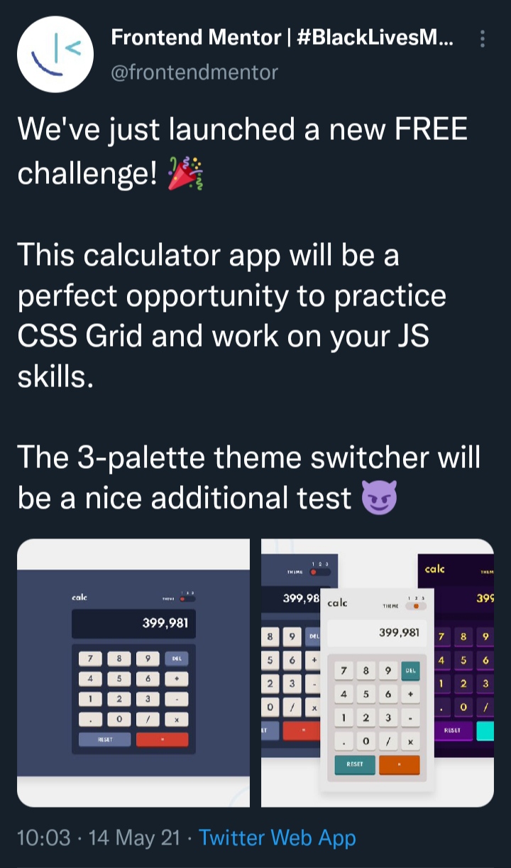
So I decided to jump on the challenge and I was able to create this.
In case, you are coming to hear about FrontendMentor for the first time. FrontendMentor is a website that helps Frontend Developers improve their skills by assigning tasks that mimic real-world problems to give budding frontend engineers a glimpse of how to tackle those kinds of problems. As I had earlier said, the task I took on this time was to create a calculator that carried out basic operations and would be able to toggle three themes. The most challenging part of the task was having to create the toggle switch to handle the themes, as I wasn't able to find tutorials on creating toggle switches to handle three themes and having previously worked on toggle switches that handled just two themes, the approach I was familiar with would not have worked in this scenario. All of these were why it was quite challenging for me.
I was later able to figure out a way to create the switch after lots of trial and error and I'd love to share what I had learnt from the whole exercise with you.
Pre-requisites
Basic knowledge of HTML and CSS especially CSS Flex properties.
Basic understanding of variable declarations in Javascript and DOM manipulation.
If you are already comfortable with all of these, then let's head right in and create our toggle switch.
Let's start by writing our markup. We will start by creating a div element and adding a switch class to it, this div element will serve as the background of the toggle switch. Then within this div, we will put in three div elements; The first div sibling will serve as a container for three radio input tags which will, in turn, be the basis for toggling through the themes. The second div sibling will be used to nest icon tags which will just serve as indicators for the themes and the last sibling div will be used to create the circle which moves whenever you click on an icon.
We are using the radio input type because it allows users to select just one option from a range of options. So in this case, only one theme can be selected at a particular time. For the icons, I used the Font Awesome CDN.
<div class="switch">
    <div class="switch-radios">
        <input type="radio" name="theme-type" value="one" id="first">
        <input type="radio" name="theme-type" value="two" id="second">
        <input type="radio" name="theme-type" value="three" id="third">
    </div>
    <div class="switch-fas">
        <i class = "fas fa-moon"></i>
        <i class = "fas fa-sun"></i>
        <i class = "fas fa-meteor"></i>
     </div>
     <div class="ball"></div>
</div>
With just our HTML code, this is what our result would look like.
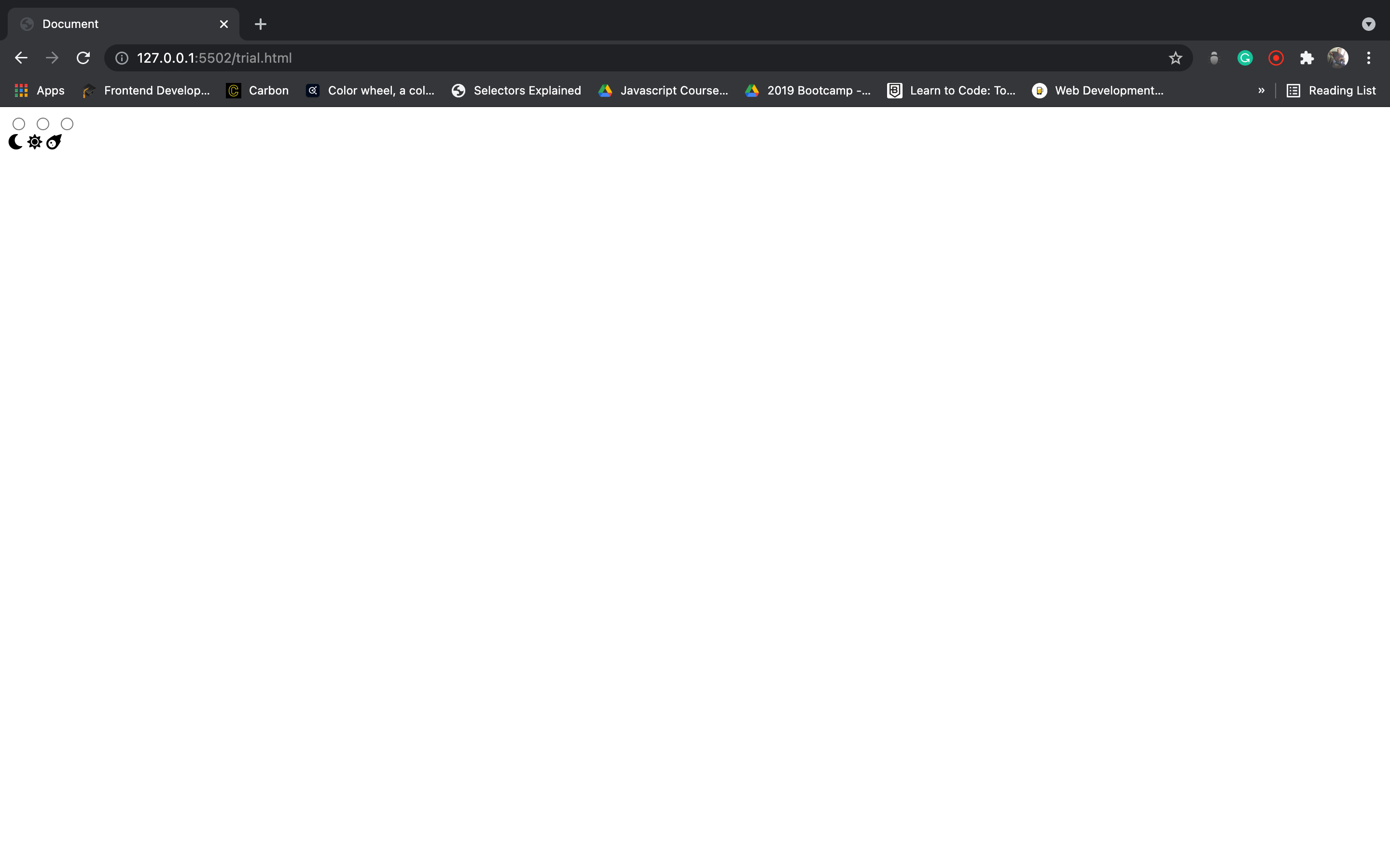
Now, that we are done with creating the markup, let us move on to the styling.
We will first set the box-sizing to border-box under the universal selector after which, we will add style properties to the body to centre the child element i.e. the div element with class switch. I'll try as much as possible to divide the styling into bits in other to easier explain the effect of the styling.
* {
    box-sizing: border-box;
}

body{
    display: flex;
    justify-content: center;
    align-items: center;
    height: 100vh;
    margin: 0;
    background-color: #623ca0;
}
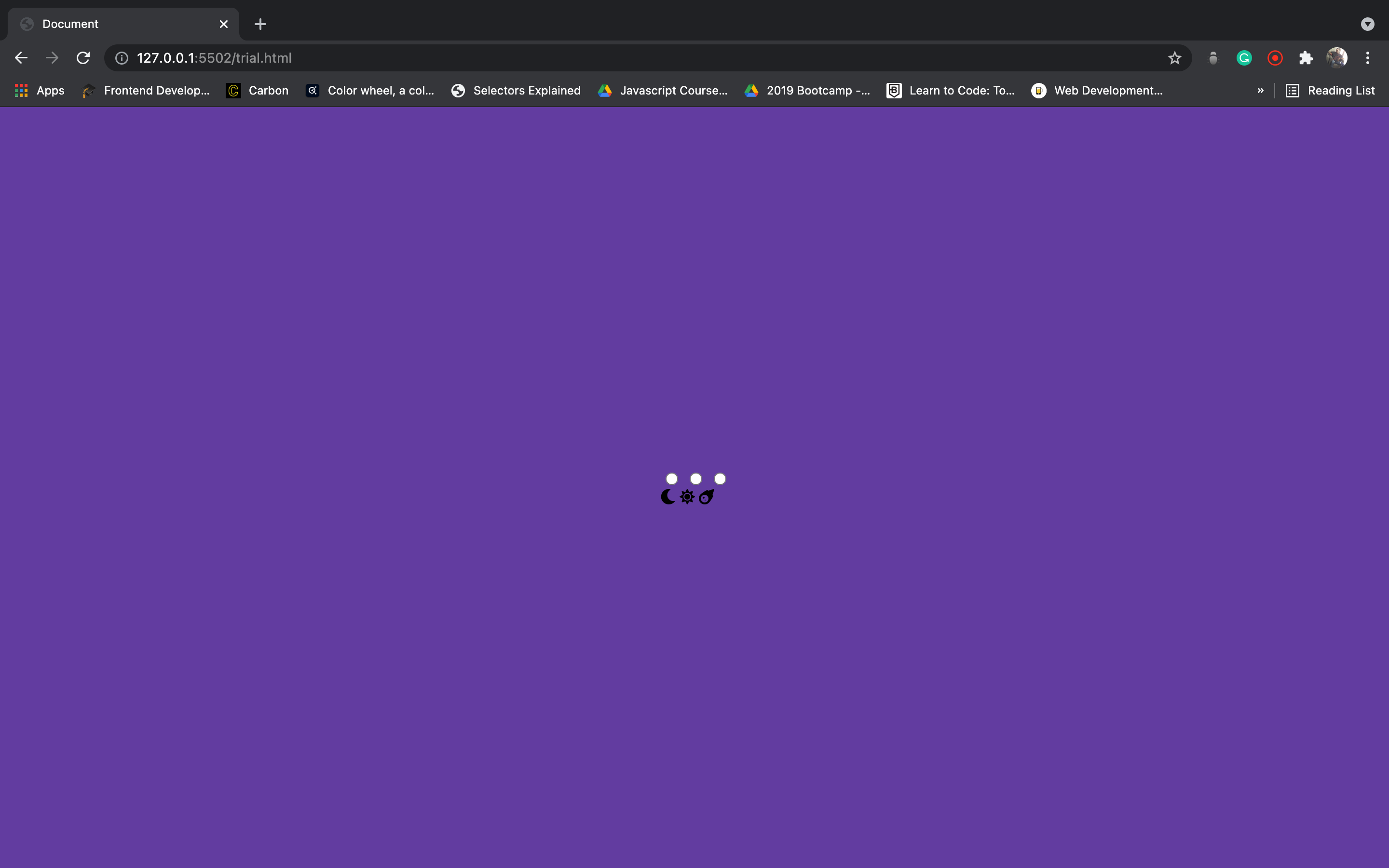
With this basic styling, we would have something that would look close to this.
Ok. Now that we have set the basic stylings let us go on to style the actual toggle switch. We will set the dimensions of the switch along with its background colour and its display properties and other minor styles. When we are done with that, we would go on into its children elements. The switch-radios > * selector represents every child element within the div containing the radio inputs, in essence selecting all the radio inputs
.switch{
    height: 30px;
    width: 100px;
    display: flex;
    justify-content: space-between;
    align-items: center;
    flex-direction: column;
    background-color: #8b66c7;
    border-radius: 50px;
    padding: 5px;
    position: relative;
    cursor: pointer;
}

.switch-radios{
    position: relative;
}

.switch-radios > *{
    position: absolute;
}
Adding this styling to our previous one, we would end up with something like this
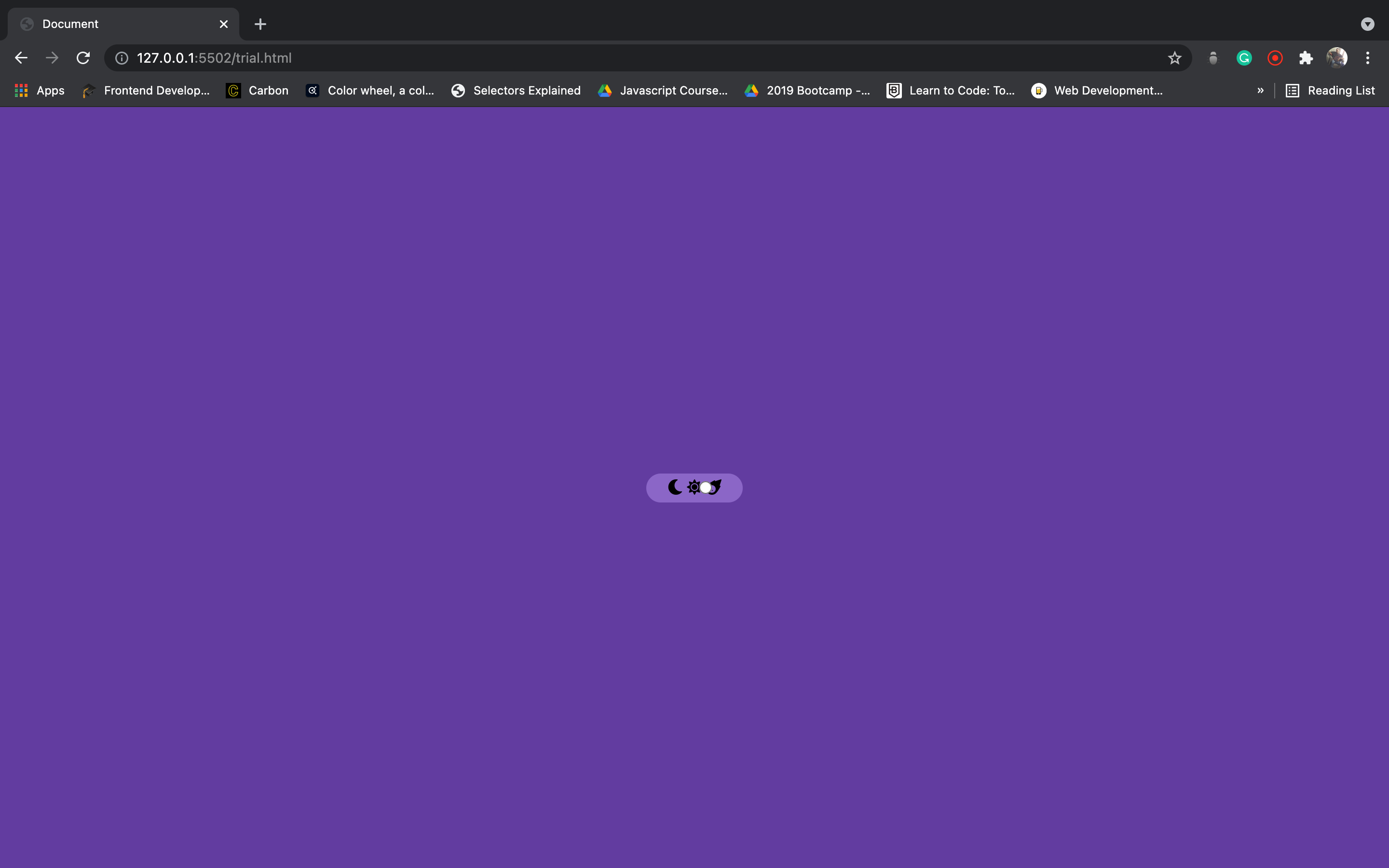
Comparing this to our previous result, we would notice that it seemed like we have just one radio input rather than the three ones we had previously. This is because we used the CSS property of position with a value of absolute so here, the radio inputs will be positioned relative to its parent element as long the parent's position is set to relative. Absolute positioning would allow us to place the radio inputs precisely where we want them to be. With the next stylings, let us then position the radio individually and set them to where we would want them to be.
.switch-fas{
    width: 90%;
    display: flex;
    justify-content: space-between;
    align-items: center;
    padding-bottom: 3px;
}

input[type = "radio"]:first-of-type{
    right: 22px;
}

input[type = "radio"]:nth-of-type(2){
    right: -10px;
}

input[type= "radio"]:last-of-type{
    right: -42px;
}
With the CSS right property, we were then able to set the horizontal position of the radio inputs. The right property only has no effect on non-positioned elements i.e. it will only be seen if the selector position has been set to either relative, relative or sticky. The switch-fas selector represents the container nesting the icons, the CSS properties it contains were written to adequately allow each radio to rest on each of them as the final result we would be expecting has the user clicking on the icon and not the radio inputs.
Adding this style to our previous ones and we would end up with something similar to this.
To add more variety to our toggle switch, we would then add individual colours to each icon along with creating our ball.
.fa-moon{
    color: #623ca0;
}

.fa-sun{
    color: #faea2d;
}

.fa-meteor{
    color: #f39529;
}

.ball{
    background: #fff;
    height: 24px;
    width: 24px;
    border-radius: 50%;
    position: absolute;
    left: 4px;
    top: 3px;
    transition: all .5s ease;
}
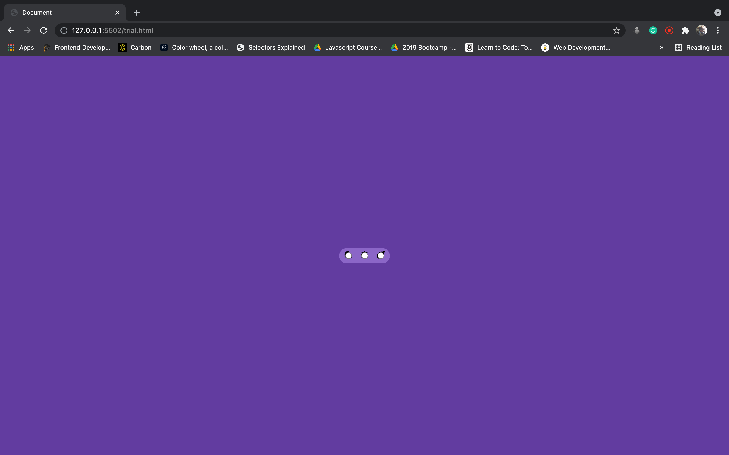
This is the result we would then get once we put all the styles together
We are done creating the look of the toggle switch, let us go on to add functionality to it by adding javascript to our code so far.
const firstThemeBtn = document.querySelector('#first');
const secondThemeBtn = document.querySelector('#second');
const thirdThemeBtn = document.querySelector('#third');
const ballBtn = document.querySelector('.ball');

firstThemeBtn.addEventListener('change', () => {
    ballBtn.style.left = '4px';
})

secondThemeBtn.addEventListener('change', () => {
    ballBtn.style.left = '38px';
})

thirdThemeBtn.addEventListener('change', () => {
    ballBtn.style.left = '72px';
})
The JS code above takes care of the sliding movement of the ball whenever any radio button is clicked. We achieved this by setting an event listener on each of the radio buttons and making each of them listen for a change event; the change event occurs when the value of the element has changed. In the case of radio buttons and checkboxes, this would be when their checked or unchecked state changes.
Though our switch looks and behaves like a toggle switch now, it isn't really toggling the themes and we are not seeing any colour changes 🤷🏾♂️. This is because we didn't include the colours we would want to be displayed when we toggled the switch in our CSS and JS file. So let us go to do this in the next code snippets.
For the CSS
body.moon{
    background-color: #623ca0;
}

body.sun{
    background-color: #faea2d;
}

body.meteor{
    background-color: #f39529;
}

body.sun .switch{
    background-color: #fff481;
}

body.meteor .switch{
    background-color: #f7ce9f;
}
For the Javascript
firstThemeBtn.addEventListener('change', () => {
    ballBtn.style.left = '4px';
    document.querySelector('body').classList.remove('sun');
    document.querySelector('body').classList.remove('meteor');
})

secondThemeBtn.addEventListener('change', () => {
    ballBtn.style.left = '38px';
    document.querySelector('body').classList.remove('moon');
    document.querySelector('body').classList.remove('meteor');
    document.querySelector('body').classList.add('sun');
})

thirdThemeBtn.addEventListener('change', () => {
    ballBtn.style.left = '72px';
    document.querySelector('body').classList.remove('moon');
    document.querySelector('body').classList.remove('sun');
    document.querySelector('body').classList.add('meteor');
})
The CSS code basically creates stylings for the body element when it has certain classes i.e. moon, sun and meteor. It then has styling included for the element with the .switch class under those conditions i.e. the background of the toggle switch would vary depending on whichever class name the body element bears. In the Javascript code, we have added new lines of code to each of the event listeners, these new additions have the simple role of either removing or adding a class to the class list of the body element. As we add and remove those classes, remember they come with certain stylings so as we add a class, we add its styling too and vice versa. So for example, anytime we click on the third radio button; the ball moves horizontally to rest on that button, the moon and sun classes along with their stylings are removed from the body element and the meteor class is added to it. This goes on to change the background colour of the body and that of the switch.
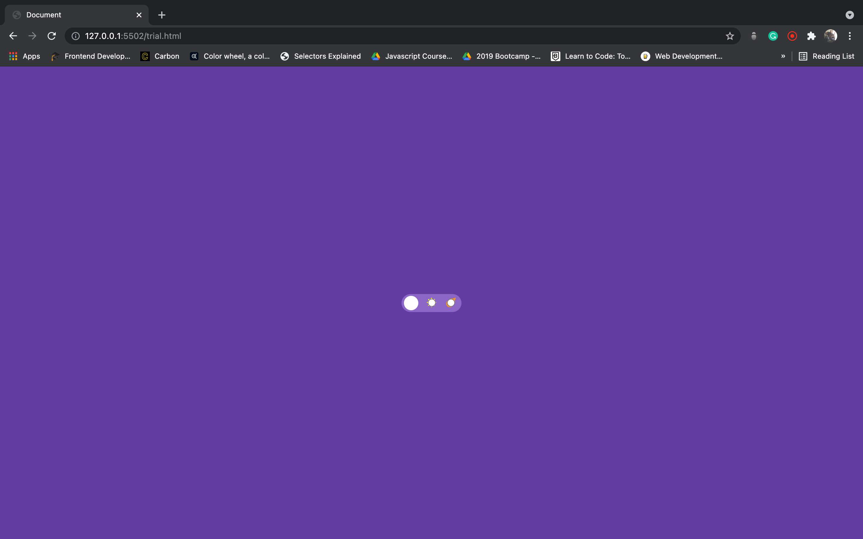
Now, we can see that we are effectively toggling through the themes but to make the switch visually appealing we would need to make a minor adjustment which would be to remove the radio buttons so we wouldn't have to click them to toggle the switch but rather we would be clicking on the icons instead.
We would do that by setting the opacity of the radio buttons to zero and then giving it a cursor value of pointer to indicate that that area is clickable.
input[type="radio"]{
    cursor: pointer;
    opacity: 0;
}
With this teeny-weeny adjustment, we now have a functional toggle switch that effectively toggles through the three themes. 🥳
Conclusion
So by simply following the steps, I laid down in this article you would be able to recreate this kind of toggle switch for any project you are working on by simply using HTML, CSS and Javascript.
To see how I implemented the toggle switch for the theme calculator task from FrontendMentor, you can check out my source code on Github.
If you would like to play around with the code we used in this tutorial, you can check it here on codepen.
Thank you for sticking with this article to the end. I really hope you learnt something today. Cheers and see you in the next article.


