

Hello guys. Today, I’ll be writing on this new UI trend that has been gaining lots of traction in the tech space as of recent. The trend is called Glassmorphism.
Over the years, different styles have greatly influenced the design community. There was Skeumorphism which attempted to create 3D effects on a 2D (flat) surface and make the interface object seem to mimic their real-world counterparts, then Neumorphism which is a portmanteau of “new” and “skeuomorphism” and was meant to give users a feeling that they were popping out of the surface by adding intensity to switches and buttons in designs with background colours, highlights, shadows, gradients and shapes and now, we have Glassmorphism as the current in-thing in design.
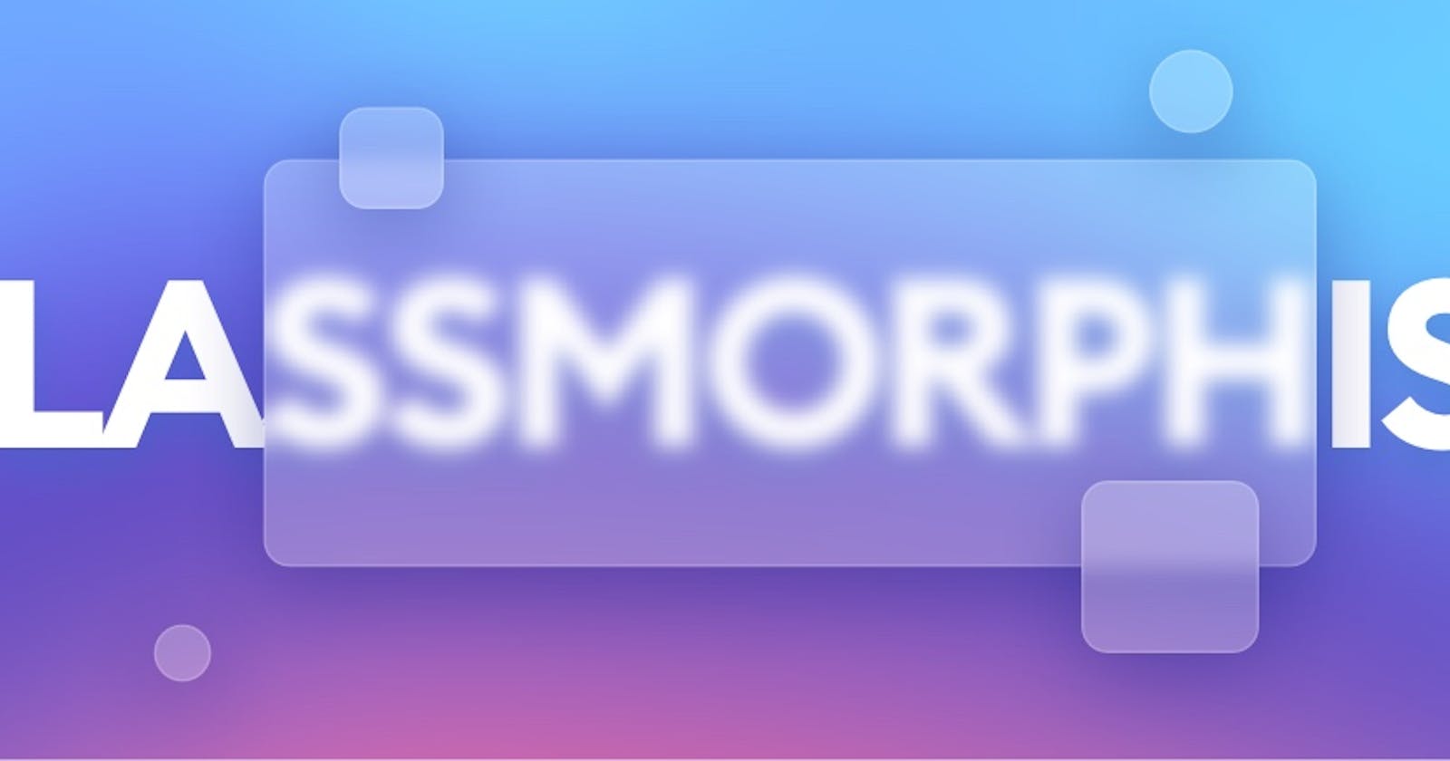
Glassmorphism, as the name implies, has to do with a glassy look which involves placing a layer, the glassy one, over a background most often a colourful one. This new trend which was invented by Michal Malewicz who also developed Neumorphism has listed on Michal’s blog, attributes that are characteristic of this design:
- Transparency (frosted-glass effect using a background blur).
- Multi-layered approach with objects floating in space.
- Vivid colours to highlight the blurred transparency.
- A subtle, light border on the translucent objects.
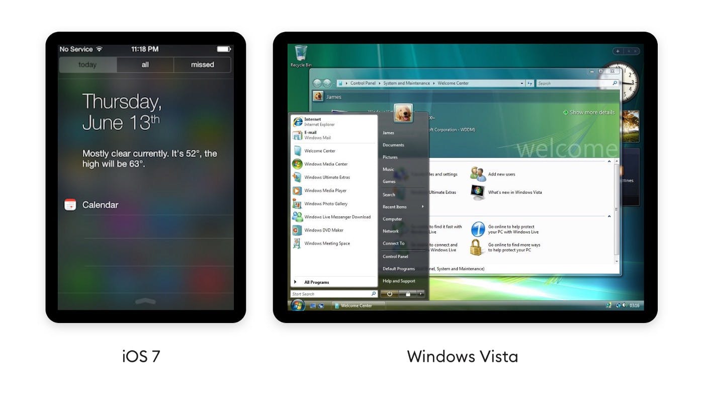
The premise of this style isn't new in itself. It has been used in Windows VISTA, iOS 7 and many other styles. It's also a part of the Fluent Design System by Microsoft - they call it Acrylic. Later this year Mac OS Big Sur came out with an implementation of this effect, making it even more mainstream.
THE MECHANICS
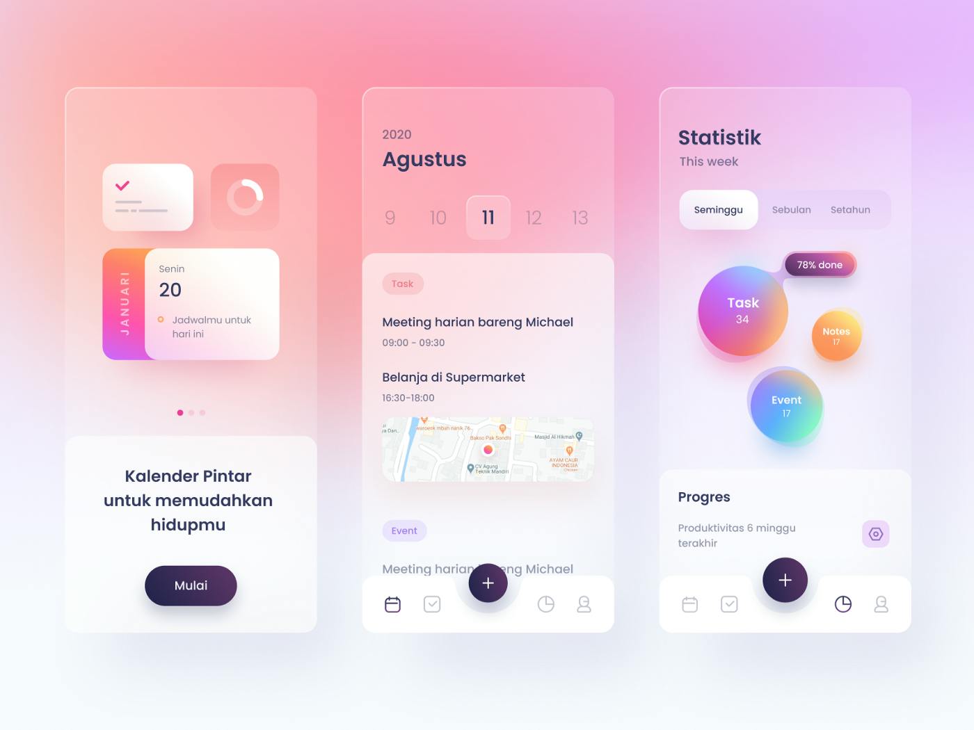
The central idea of this style is to create an impression of frosted glass above a backdrop and this is achieved through finding a balance between background blur, shadows and transparency. A colourful background is necessary for the effect to be obvious, as dull, low-contrast backgrounds simply fade away under the panels and most of the effect is lost. A thin light outline can also be added to the pane to simulate the glass edge. The final step is then adding a shadow under the pane.
So let’s try to replicate a glassmorphic design using HTML and CSS. One thing to have in mind is the main CSS property that gives the glass pane its frosty look, this is the backdrop-filter property with the value of blur. The backdrop-filter lets you apply graphical effects such as blurring or colour shifting to the area behind an element.
The class “container” would be the background, it has a linear gradient background-colour and it was set to a viewport of 100% viewport height. The “glass-container” serves to place the glass pane with class “glass” in the centre of the page. The glass pane then has it’s background set to white with a transparency of 0.25, the transparency is important as it would allow for the see-through effect, then a thin border is added to give an impression of a glass edge, a box shadow is added to create an impression of depth and most importantly, the backdrop-filter property to provide the blur effect. The other components were just to complement the design.
You can change the background-color and it’s transparency of the pane as you wish, in order to give it a tinted colour of your choice. You can also alternate the blur value as you wish; an increased value would mean an increase in the blur effect also.
I have been recently working on making a description card with the glassmorphic effect but it's a little incomplete, and I'd love for anyone who has learnt something, no matter how little, from this article to make a little contribution to the GitHub repo so maybe we can learn one or two things about open source on the side. Below is the link to the repo of the design.
Glassmorphic Description Card Website
If you are interested in creating more designs, a good place for inspiration would be on Dribble. Just put "glassmorphism" into the search bar, they are a lot of beautiful design out there.
Thank you for reading to the end, I am very grateful. If you liked the article and found it helpful, please do well to share and follow.
Merry Christmas🎄and Happy Holidays. Stay safe. 🤗 😷